
Table of Contents
Metallic markers on dark paper create a kind of quiet radiance that feels almost ceremonial—lines that glow, shapes that shimmer, and pages that seem to hold their own internal light. When gold, silver, and copper meet deep‑toned paper, the effect is both intimate and dramatic. It’s a medium that invites presence, slowness, and a sense of wonder as each stroke lifts from the darkness like a small revelation. This post explores that luminous world, focusing on limited palettes, true metallic tones, and the subtle power of pairing metallics with white and black markers for contrast and clarity.
The Beauty of Metallic Art on Dark Pages
Working with metallic markers on dark paper feels like sketching with light itself. The ink sits on the surface, catching illumination from every angle, shifting as you tilt the page. It’s a medium that rewards simplicity and intentionality—every mark becomes visible, every gesture amplified.
Artists often describe this process as grounding. The dark background creates a sense of calm, a visual quiet that allows metallic lines to breathe. Whether you’re filling a sketchbook spread or creating small luminous studies, metallic art encourages you to slow down and savor the act of drawing.
Limiting Colors: The Power of Restraint
Limiting your palette is one of the most transformative choices you can make in metallic art. Dark paper already provides a dramatic foundation; adding too many colors can dilute that impact. A restrained palette creates cohesion, clarity, and a sense of visual rhythm.
A limited palette also encourages deeper exploration. Instead of reaching for more colors, you begin to explore line weight, texture, repetition, and negative space. The page becomes a study in nuance—how a single metallic tone shifts under different lighting, how a repeated motif becomes meditative, how simplicity can feel luxurious.
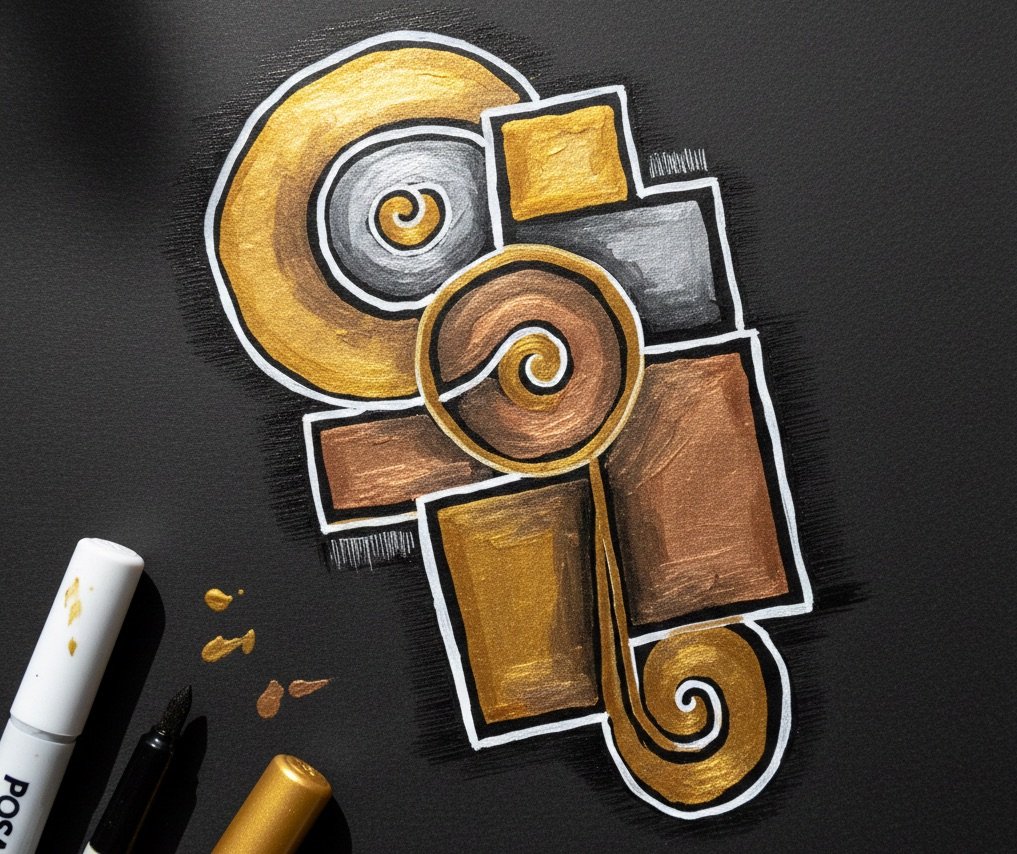
The True Metals: Gold, Silver, and Copper
Gold, silver, and copper form the core trio of metallic sketchbook work. Each carries its own emotional tone and visual personality.
Gold
Warm, celebratory, and timeless. Gold feels like sunlight captured in ink. On black or deep navy paper, it glows with a soft radiance that feels both ancient and modern.
Silver
Cool, quiet, and reflective. Silver has a lunar quality—soft, ethereal, and slightly mysterious. It pairs beautifully with geometric patterns, celestial themes, and minimal linework.
Copper
Earthy, rich, and deeply expressive. Copper is often overlooked, but on dark paper it becomes a star. It carries warmth without the brightness of gold, creating a grounded, almost tactile glow.
Together, these three metals form a palette that feels elemental—like drawing with small pieces of the natural world.
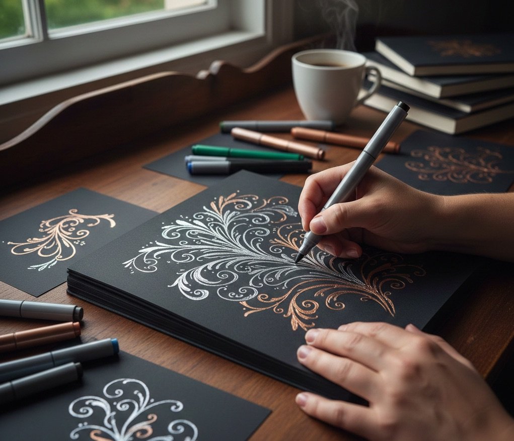
Gold and Silver: A Classic Duo
Gold and silver together create a dynamic interplay of warm and cool tones. They complement each other without competing, offering contrast that feels balanced and harmonious.
Artists often use:
- Silver for structure—outlines, frameworks, geometric shapes
- Gold for emphasis—accents, highlights, focal points
This pairing works beautifully for botanical sketches, celestial spreads, and abstract linework. The two tones dance across the page, shifting as the light changes.
Copper: The Underrated Metallic
Copper deserves its own spotlight. It brings a depth and richness that neither gold nor silver can replicate. On dark paper, copper feels almost sculptural—like embossed metal or aged patina.
Copper pairs well with:
- Deep charcoal paper
- Warm‑toned dark browns
- Black pages for high contrast
- Silver accents for a cool‑warm interplay
It’s a perfect choice for artists who want a metallic that feels organic, earthy, and quietly bold.
Colors: When to Add and When to Hold Back
While metallics shine brightest in limited palettes, there are moments when adding a hint of color can elevate the page. Deep jewel tones—emerald, sapphire, garnet—can complement metallics without overwhelming them. But restraint is key.
A single color can act as:
- A grounding element
- A subtle contrast
- A way to shift mood or temperature
Think of color as a whisper rather than a shout. Metallics should remain the stars.
Metals and Limited Palettes: Finding Harmony
A limited metallic palette can be incredibly expressive. Many artists choose one metal per page or per spread, allowing the tone to define the mood. Others combine two metals for contrast, or all three for a layered, alchemical feel.
Some approaches include:
- Monochrome metallic pages—all gold, all silver, or all copper
- Dual‑metal spreads—gold + silver, silver + copper, gold + copper
- Tri‑metal compositions—used sparingly, like jewelry accents
Limiting your palette doesn’t restrict creativity—it sharpens it.
Mixing Metallics with White and Black Markers
White and black markers become essential companions when working with metallics on dark paper. They act like anchors, guides, and quiet counterpoints.
White Markers
White adds clarity and breath. It can outline metallic shapes, create highlights, or introduce soft contrast. White ink feels like a whisper of daylight on a night sky.
Black Markers
On dark paper, black becomes a textural tool rather than a color. It deepens shadows, sharpens edges, and adds subtle structure. Black ink can also soften transitions between metallic tones.
Using Them as Outliners
White and black markers can frame metallic shapes, define boundaries, or create layered effects. They help metallics stand out without competing for attention.
Together, metallics + white + black form a beautifully balanced toolkit—simple, expressive, and endlessly adaptable.

 Sketchbooks.org | TRADITIONAL MATERIALS
Mechanical Pencils in Art | What They Are and Why Artists Use Them
Discover the precision of the mechanical lead. Explore why many artists prefer these consistent tools for technical drawing and fine detail work.
Frequently Asked Questions
Do metallic markers show up well on all dark papers?
They appear brightest on black and deep navy, but they also glow beautifully on charcoal, plum, and dark brown.
Is it better to use one metallic color or several?
Both approaches work; a single metal creates cohesion, while two or three add contrast and depth.
How does copper compare to gold and silver?
Copper is warmer and earthier, offering a rich glow that feels more grounded than gold or silver.
Can white markers be used with metallics?
Yes, white adds clarity, contrast, and soft highlights that complement metallic tones.
Do metallic markers blend with each other?
They don’t blend like traditional markers, but layering can create subtle shifts in texture and shine.
Should I limit my palette when working with metallics?
A limited palette often enhances the luminous quality of metallic ink and keeps the page visually balanced.
Can metallic markers be used for detailed linework?
Absolutely—they’re excellent for fine lines, patterns, and intricate motifs.
Do metallics photograph well?
They often look stunning in natural light, capturing the reflective qualities that make them unique.
Are metallic markers good for beginners?
Yes, their immediate visual impact makes them welcoming for artists at any level.
Final Thoughts
Metallic markers on dark paper offer a luminous, meditative way to explore line, contrast, and mood. Gold, silver, and copper—the true metals—each bring their own voice to the page, and limiting your palette allows those voices to shine. Paired with white and black markers, metallics become even more expressive, creating pages that feel both grounded and radiant. Whether you’re filling a sketchbook with shimmering studies or exploring new ways to express light and shadow, metallic art invites you into a world where simplicity becomes luminous and every mark feels like a small spark in the dark.

Ready to Share Your Work?
What emotions do you primarily aim to capture in your sketchbook art?

Love this look. It’s like making your own Black Velvet Paintings in a sketchbook.