
Table of Contents
Chiaroscuro shading is one of the most powerful tools in an artist’s visual vocabulary. By emphasizing dramatic light and shadow, artists can create the illusion of three-dimensional form, evoke mood, and guide the viewer’s eye through a composition. Whether you’re working in graphite, charcoal, ink, or digital media, mastering chiaroscuro will transform the way you think about volume and presence on a two-dimensional surface.
This post explores the fundamentals of chiaroscuro shading, explains how to apply it to modeling form, and offers practical insights for artists developing traditional or digital techniques.
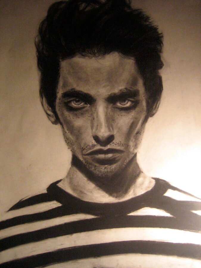
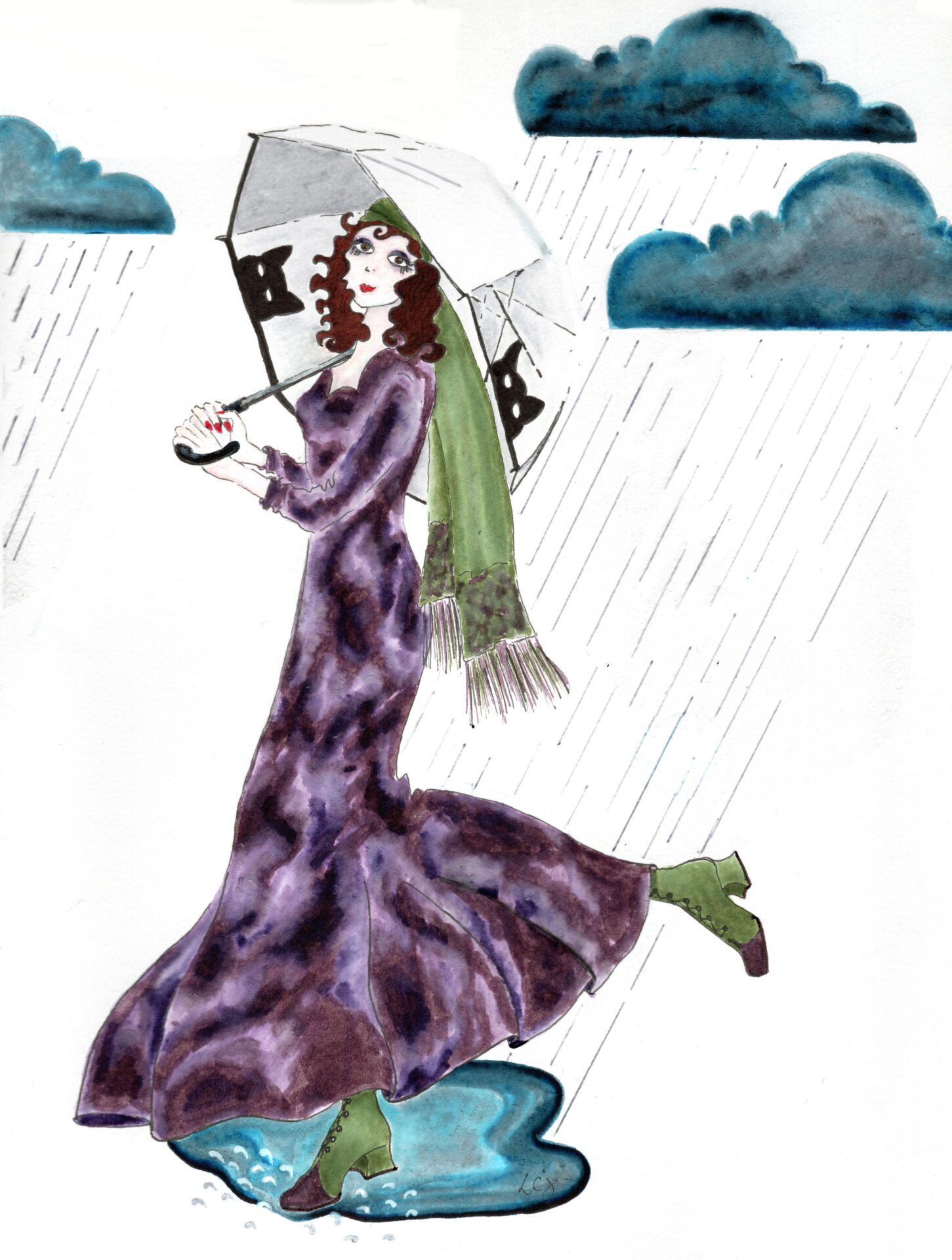
credit: KLOSVO
What Is Chiaroscuro?
Chiaroscuro is an Italian term that translates to “light-dark.” In art, it refers to the use of strong contrasts between light and shadow to model three-dimensional form. While it became widely recognized during the Renaissance and Baroque periods, the principle is timeless—it applies as much to a graphite figure drawing as to a cinematic portrait or digital concept sketch.
The essence of chiaroscuro is not just darkness; it’s the interplay of values used to emphasize form, depth, and volume. It focuses on rendering how light interacts with surfaces, wrapping around objects to reveal structure and spatial relationship.
Why Chiaroscuro Is Essential for Form Modeling
Without a solid grasp of value and edge transition, drawings often look flat or stylized. Chiaroscuro shading offers a framework for representing form in a convincing way.
Key reasons why it’s indispensable:
- Emphasizes spatial relationships by distinguishing planes through tonal shifts
- Clarifies structure and simplifies complex forms with light logic
- Creates atmosphere and emotional weight through dramatic contrasts
- Directs viewer attention by guiding the eye from focal light zones into shadow
It bridges technical accuracy and expressive interpretation—two sides of skilled draftsmanship.
Why Chiaroscuro is Indispensable for Form:
1. EMPHASIZES SPATIAL RELATIONSHIPS:
* Distinguishes planes through tonal shifts.
2. CLARIFIES STRUCTURE:
* Simplifies complex forms with light logic.
3. CREATES ATMOSPHERE & EMOTIONAL WEIGHT:
* Achieved through dramatic contrasts.
4. DIRECTS VIEWER ATTENTION:
* Guides eye from light zones into shadow.
Understanding Value, Tone, and Edge
To successfully use chiaroscuro shading, you must develop sensitivity to value structure and how forms transition through light.
- Core Shadow: The darkest area where light is fully blocked.
- Highlight: The brightest area directly facing the light source.
- Midtone: Transitional value between shadow and highlight.
- Reflected Light: Light that bounces into the shadowed side, adding dimension.
- Cast Shadow: A shape projected from the object that follows its contours on another surface.
Edges matter too—soft transitions suggest curvature or atmospheric blur, while crisp edges often imply firm planes or artificial light. Learning to control these transitions brings form to life.
Choosing Materials for Chiaroscuro Shading
While chiaroscuro can be applied in nearly any medium, certain tools lend themselves especially well to rich value contrast and tonal control:
- Charcoal pencils and compressed sticks: Excellent for deep blacks and sensitive blending
- Graphite pencils (2B–8B): Good for line clarity and smooth tonal shifts
- Conté and sanguine: Offer classical tones and expressive range
- Digital brushes with pressure sensitivity: For seamless value control in Procreate or Photoshop
- White chalk or pastel: For lifting highlights on toned paper
Select a surface with enough tooth if you’re working traditionally, or use textured brushes digitally to mimic that tactile friction.
Lighting Setup for Observational Practice
Lighting is everything when practicing chiaroscuro shading. Position your light source to create one strong, directional beam—usually 45° to one side of your subject. This creates:
- A clear hierarchy of values
- Strong cast shadows that enhance structure
- Volumetric shifts that wrap around the form
Avoid diffuse lighting if you’re studying form. Instead, work with a spotlight or clamp lamp, and place your object (or model) in an uncluttered environment for clarity.
Exercises to Strengthen Your Chiaroscuro Technique
To integrate chiaroscuro principles into your workflow, try these practical exercises:
- Spherical forms: Practice light falloff and reflected light on spheres in multiple angles
- Still life objects: Use eggs, fruit, or statues for controlled cast shadow practice
- Value scales: Create gradual transitions from black to white to train sensitivity
- Figure drawing: Block in mass using shadow shapes before line refinement
- Master studies: Recreate high-contrast sections from classical drawings or paintings
Consistency matters. Focus on accuracy first—then exaggerate contrast for stylistic or emotional emphasis.
Chiaroscuro in Digital Art
Digital artists can use chiaroscuro to create cinematic lighting effects, stylized portraits, or immersive landscapes. Leverage layer modes (Multiply, Overlay), adjustment tools (Curves, Levels), and blending brushes to:
- Shape character faces through light wrapping and occlusion
- Highlight mood with selective illumination
- Create focal points through contrast control
- Use grayscale studies to test composition before adding color
Digital tools offer endless customization, but the underlying light logic remains the same as in traditional media.
Chiaroscuro in Digital Art:
* **Shape Character Faces:** Use light wrapping and occlusion.
* **Highlight Mood:** Employ selective illumination.
* **Create Focal Points:** Control through contrast.
* **Utilize Greyscale Studies:** Test composition before color.
TOOLS: Layer modes (Multiply, Overlay), adjustment tools (Curves, Levels), blending brushes.

 Sketchbooks.org | SKETCHBOOKS IN PRACTICE
Diverse Professions Keep A Sketchbook
Discover the unexpected power of the visual journal. Explore how professionals from all walks of life use sketching to solve problems and dream.
Frequently Asked Questions
What is chiaroscuro shading in drawing?
It’s the technique of using strong light and dark contrast to represent form and depth.
Why is chiaroscuro important in art?
It models volume, enhances realism, and adds emotional weight to compositions.
Can you use chiaroscuro in digital art?
Yes—digital brushes and layers can replicate or extend chiaroscuro techniques.
Is chiaroscuro the same as shading?
Not exactly—shading is general; chiaroscuro is a specific, high-contrast approach.
What tools are best for chiaroscuro drawing?
Charcoal, soft graphite, and toned paper with white chalk are traditional favorites.
How do I learn chiaroscuro if I’m a beginner?
Start with simple forms, use directional lighting, and focus on blocking in shadow shapes.
What’s the difference between chiaroscuro and tenebrism?
Tenebrism is an exaggerated form of chiaroscuro with extreme darkness and spotlighting.
Exercises for Stronger Chiaroscuro:
* **Spherical Forms:** Practice light falloff and reflected light.
* **Still Life Objects:** Use eggs, fruit, or statues for cast shadow practice.
* **Value Scales:** Create gradual black-to-white transitions.
* **Figure Drawing:** Block in mass using shadow shapes before line refinement.
* **Master Studies:** Recreate high-contrast sections from classical art.
Final Thoughts
Chiaroscuro shading isn’t just a technique—it’s a visual philosophy. It helps you go beyond contour lines and step into the world of volume, atmosphere, and mood. Whether you work in sketchbooks or on a digital tablet, studying light and shadow will bring clarity and weight to your art. Begin with form, sharpen your values, and let light be the language that shapes your work.
The more you observe the world through chiaroscuro’s lens, the more confidently you’ll render your own.
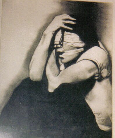
credit: TWIGGY
Ready to Share Your Work?
What is your dream sketching trip destination?

Car-a-va-g-io!