
Table of Contents
Unique Hand Lettering
Style That Grows From the Page
Developing a unique hand lettering style is a blend of practice, inspiration, and exploration. Your sketchbook is your personal lab—where ideas evolve and where style blossoms. It’s a space to test, refine, and rediscover your visual voice without pressure. In this guide, you’ll learn how to cultivate your lettering organically, optimize for visual impact, and unlock creative breakthroughs through playful repetition and intentional variation.
Your style isn’t found—it’s grown.
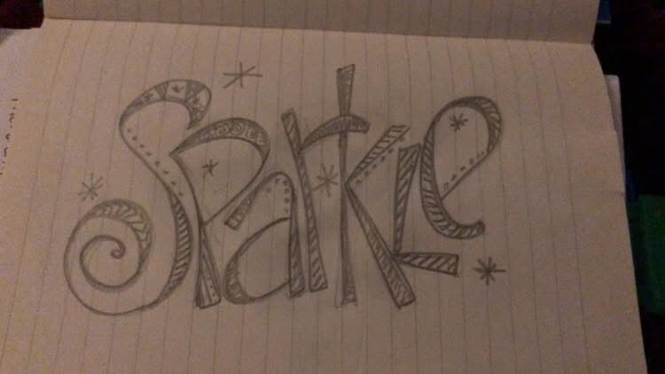
credit: SUBGARDEN
Here’s your section reformatted with one H2 heading followed by H3 and H4 structure—fully aligned with your modular guide style and enriched for clarity and flow:
Why Your Sketchbook Is the Ideal Place for Lettering Exploration
Freedom to Experiment, Space to Evolve
Unlike client work or polished pieces, your sketchbook offers a low-pressure environment where you can explore, invent, and refine without fear. It’s a space where your lettering voice can emerge organically—through repetition, risk, and reflection.
Allow Spontaneous Ideation
Let Your Hand Lead the Way
Try new flourishes, layouts, or character shapes without planning. Let your hand move intuitively and see what emerges. This kind of freeform exploration:
- Sparks unexpected breakthroughs
- Builds confidence in your visual instincts
- Keeps the process playful and alive
Your sketchbook becomes a playground for ideas.
Encourage Risk-Taking with Style Combinations
Break Rules to Invent New Ones
Mix serif with script, bold with delicate, geometric with organic. The sketchbook is a safe space to:
- Test unconventional pairings
- Discover new visual rhythms
- Push past stylistic boundaries
Risk leads to originality—and originality starts with permission to explore.
Offer a Visible Record of Artistic Evolution
Watch Your Style Take Shape
Flip back through your pages and you’ll see your lettering shift, sharpen, and expand. This archive:
- Reveals growth over time
- Captures emotional and stylistic phases
- Becomes a source of pride and inspiration
Your sketchbook is a living portfolio—messy, honest, and uniquely yours.
Master the Basics: Letter Forms, Spacing, and Flow
Build Muscle Memory Before You Break the Rules
Before you dive into wild flourishes or experimental layouts, it’s essential to understand the foundations of hand lettering. Mastering the basics gives you control, confidence, and clarity. It’s the groundwork that makes your style look intentional rather than accidental. Once these elements become second nature, you’ll be free to bend and remix them with purpose.
Your sketchbook is the perfect place to practice, refine, and internalize these core principles.
Stroke Contrast
Create Rhythm Through Line Variation
Thin-to-thick transitions give your lettering movement and energy. Practicing stroke contrast helps you:
- Understand pressure control and pen angle
- Add visual interest and hierarchy to your words
- Develop a dynamic, expressive style
Contrast is what makes lettering dance on the page.
Letter Balance
Build Harmony Through Symmetry and Spacing
Balanced letters feel stable and intentional. Focus on:
- Even spacing between characters
- Consistent height and baseline alignment
- Symmetrical shapes where appropriate
Balance doesn’t mean rigidity—it means cohesion.
Consistency
Make Your Style Feel Intentional
Consistency ties your lettering together. It’s what makes a style recognizable. Practice:
- Repeating shapes and flourishes across letters
- Maintaining similar stroke weights and angles
- Keeping spacing and alignment steady
Consistency builds trust in your visual language.
Play With Different Tools and Mediums
Let Your Materials Shape Your Style
Your tools define your lines—and each one opens up unique possibilities. Exploring different mediums helps you discover what feels natural, expressive, and joyful in your hand.
Brush Pens
Add Painterly Elegance
Brush pens offer fluidity and variation. They’re ideal for:
- Expressive scripts and flourishes
- Dynamic stroke contrast
- Organic, flowing compositions
They respond to pressure like a dance partner—soft, bold, and full of motion.
Fineliners
Prioritize Clarity and Precision
Fineliners are perfect for:
- Clean, crisp letterforms
- Detailed layouts and spacing practice
- Structured styles like monoline or geometric lettering
They offer control and consistency—great for foundational work.
Markers and Gel Pens
Inject Personality Through Color
These tools bring vibrancy and playfulness. Use them to:
- Add emphasis or mood through color
- Explore layered effects and textures
- Make your lettering pop off the page
They’re especially fun for themed pages, journaling, or expressive prompts.
Trying varied tools helps you identify what feels right for your hand and style. Let your sketchbook be a testing ground—where each pen, brush, or marker reveals a new facet of your lettering voice.
Inspiration vs. Imitation: Navigating Visual Influence
Grow Your Style Without Losing Your Voice
In a world overflowing with visual references, it’s easy to blur the line between inspiration and imitation. But your sketchbook is a place to digest, not duplicate. It’s where outside influences become internalized, transformed, and reimagined through your unique lens. The goal isn’t to copy—it’s to respond. To let visual ideas spark curiosity, experimentation, and personal evolution.
Use references as seeds—not blueprints.
Reference Typefaces With Distinct Rhythm
Learn From the Pulse of Letterforms
Study typefaces that have strong personality—those with dynamic contrast, playful proportions, or expressive curves. Let them teach you:
- How rhythm and spacing affect readability
- How structure can support emotion
- How style choices create tone and voice
Trace, deconstruct, and remix—but always with intention.
Explore Graffiti and Signage With Bold Lettering
Find Energy in the Everyday
Graffiti tags, vintage signs, and urban murals offer raw, unapologetic style. They’re full of:
- Bold strokes and exaggerated forms
- Inventive layouts and spontaneous flair
- Cultural context and visual storytelling
Use these influences to loosen your grip on perfection and embrace expressive lettering.
Study Global Scripts and Calligraphy Traditions
Expand Your Visual Vocabulary
From Arabic calligraphy to Japanese kana, global scripts offer rich histories and rhythmic beauty. Studying them helps you:
- Appreciate diverse line systems and stroke logic
- Discover new shapes, textures, and flow patterns
- Build cultural awareness and visual empathy
Let these traditions inform—not define—your style.
Practice Variation With Purpose
Repeat, Remix, Refine
Pushing creative boundaries doesn’t mean abandoning structure—it means playing within it. Repeating alphabets with intentional variation helps you discover what feels natural, expressive, and unique to your hand. Your sketchbook becomes a testing ground for rhythm, proportion, and layout. Through purposeful repetition, your artistic instincts surface and solidify.
This is where style is shaped—one letterform at a time.
Use Grid Systems to Test Symmetry
Build Structure to Support Creativity
Grids help you analyze spacing, alignment, and balance. They’re especially useful for:
- Practicing uniformity across letterforms
- Testing how flourishes interact with structure
- Comparing variations side-by-side
Grids don’t restrict—they reveal. They show you where your style holds and where it wants to break free.
Change X-Heights for Dynamic Character
Shift Proportions to Shift Personality
X-height—the height of lowercase letters—affects tone, readability, and visual rhythm. Try:
- Enlarging x-heights for a playful, modern feel
- Compressing them for elegance or tension
- Mixing proportions to explore contrast
Small changes in height can dramatically shift the mood of your lettering.
Try Layout-Based Lettering
Let Composition Lead the Way
Move beyond horizontal baselines. Explore:
- Curved text that follows a circular path
- Diagonal layouts that add motion and energy
- Stacked or staggered arrangements for visual impact
Layout-based lettering turns words into design elements—inviting interaction and surprise.
By exploring multiple renditions, you build fluency and confidence. Your sketchbook becomes a living archive of style development—where repetition leads to revelation.
Identify Your Style Anchors
Discover the Traits That Make Your Lettering Yours
Style anchors are the recurring visual decisions that define your lettering identity. They’re the subtle quirks, preferences, and patterns that emerge through repetition—often unconsciously. Over time, these anchors become your visual fingerprint. They help your work feel cohesive, recognizable, and emotionally resonant. The goal isn’t to force a style—it’s to notice what keeps showing up, and refine it with intention.
Your sketchbook is the perfect place to observe, test, and evolve these anchors.
Look Out for Unique Serif Angles
Study the Tilt, Curve, and Weight of Your Terminals
Serifs are more than decorative—they’re directional cues. The way you shape and angle them can say a lot about your style:
- Vertical serifs suggest structure and tradition
- Angled or curved serifs add motion and personality
- Exaggerated terminals can become signature motifs
Compare your serifs across different letters. Do they lean? Flare? Stay rigid? These micro-decisions often become macro-style indicators.
Notice Repeated Stroke Directions
Track the Flow of Your Hand
Every letter has a rhythm, and your stroke direction defines it. Over time, you may notice:
- Consistent entry or exit points
- Preferred loop directions (clockwise vs. counterclockwise)
- A tendency toward upward or downward motion
These patterns affect legibility, energy, and emotional tone. They’re also deeply tied to muscle memory—your hand’s natural choreography.
Embrace Decorative Quirks That Feel Natural
Let Your Instincts Become Intentional
Maybe you always add a loop to your lowercase “g,” or a flourish to your uppercase “R.” These quirks aren’t mistakes—they’re style seeds. Ask:
- Which embellishments feel intuitive, not forced?
- What visual habits keep reappearing?
- Are there shapes or accents that make your letters feel “complete”?
Refining these quirks helps you move from imitation to innovation.
Keep Refining Until Your Visual Fingerprint Becomes Unmistakable
Style Is a Process, Not a Product
Your style anchors won’t emerge overnight. They’ll evolve through:
- Iteration and reflection
- Studying your own sketchbook history
- Testing variations and noting what feels “right”
Eventually, your lettering will carry a sense of you—even when stripped of color or context. That’s the power of style anchors: they make your work speak before the words do.
Use Style Challenges to Stretch Your Creativity
Structure That Sparks Discovery
Style doesn’t emerge from repetition alone—it grows through variation. Structured challenges offer a playful way to push boundaries, build consistency, and unlock new visual ideas. They create momentum, reduce decision fatigue, and help you explore your lettering instincts from multiple angles. The more styles you test, the quicker your personal voice begins to surface.
Your sketchbook becomes a laboratory for growth—one prompt at a time.
Alphabet a Day Using Different Mood Inspirations
Let Emotion Shape Your Letterforms
Assign a mood to each day—joy, melancholy, curiosity, serenity—and draw the full alphabet in that emotional tone. This challenge helps you:
- Explore how line weight, spacing, and embellishment reflect feeling
- Build a library of expressive variations
- Strengthen your ability to design with intention
Mood-driven alphabets reveal how deeply style is tied to emotion.
Weekly Quote Re-Lettered in Three Styles
Practice Adaptability and Visual Voice
Choose one quote per week and re-letter it in three distinct styles—elegant, bold, playful, minimalist. This exercise:
- Builds flexibility in layout and tone
- Helps you identify which styles feel most natural
- Encourages exploration of contrast and hierarchy
You’ll start to see which choices are intuitive—and which stretch your skills.
Daily “Letter Remix” Using Different Embellishments
Transform Familiar Forms With Flair
Pick one letter each day and redraw it using different decorative elements—flourishes, shadows, textures, serifs. This challenge:
- Sharpens your understanding of form and variation
- Helps you develop a personal library of stylistic accents
- Encourages playful experimentation without pressure
Remixing letters builds fluency and fuels innovation.
Keep Style Consistent But Fluid
Let Your Voice Evolve Without Losing Its Core
A unique style isn’t rigid—it’s responsive. It should be recognizable across projects, yet flexible enough to grow with your ideas, tools, and emotional states. Consistency builds identity, but fluidity allows for innovation. Your sketchbook becomes the perfect space to balance both—tracking your visual language as it matures, shifts, and deepens over time.
Think of your style as a melody: familiar, but open to new harmonies.
Review Sketchbook Progress Monthly
Reflect to Refine
Set aside time each month to flip through your pages. Look for:
- Recurring shapes, textures, or motifs
- Shifts in tone, layout, or color use
- Pages that feel most “you”—and ask why
This reflection helps you identify what’s working, what’s changing, and what you want to explore next. It’s not about critique—it’s about clarity.
Define New Aesthetic Goals Per Project
Let Each Series Stretch You
Before starting a new sketchbook or themed series, set a few visual intentions. For example:
- “Use only muted tones and soft textures”
- “Explore asymmetry and negative space”
- “Focus on expressive line weight and emotional typography”
These goals give structure without confinement—helping you stretch your style while staying grounded in your voice.
Allow for Inconsistency—It Breeds Growth
Let the Messy Pages Teach You
Not every page will match your aesthetic. That’s good. Inconsistency reveals:
- New directions worth exploring
- Emotional shifts that influence your work
- Technical experiments that may become future anchors
Your sketchbook is a living document. Let it reflect your full creative spectrum—not just your polished highlights.
Your Sketchbook Acts Like a Visual Diary
Track Style Maturity Over Time
As you continue sketching, you’ll notice:
- How your style adapts to new tools or moods
- Which elements remain constant across seasons
- How your visual language becomes more intentional
This diary isn’t just a record—it’s a roadmap. It shows you where you’ve been, and hints at where you’re going.
Refine Digitally, But Return to Analog Roots
Polish With Pixels, Create With Paper
Once your lettering style begins to feel consistent, it’s natural to take it digital. Vector platforms like Illustrator or hand-drawn apps like Procreate allow you to refine, scale, and share your work with precision. But digital tools are for refinement, not origin. Your sketchbook remains the birthplace of raw ideas, emotional nuance, and spontaneous breakthroughs.
Think of digital as your editing suite—and analog as your creative hearth.
Use Digital Platforms to Polish Your Style
Smooth, Export, and Expand
Apps like Illustrator, Affinity Designer, or Procreate help you:
- Smooth out curves and spacing
Refine stroke weight, adjust kerning, and perfect alignment with precision tools. - Export your style across formats
Create scalable assets for print, web, or motion graphics—logos, posters, social templates, and more. - Build logos or font sets
Turn your hand lettering into usable typefaces or brand elements with consistent structure and polish.
Digital refinement helps your style travel—but it starts with the hand.
Never Abandon Your Sketchbook
Keep the Messy Magic Alive
Your sketchbook is where ideas breathe before they’re boxed. It offers:
- Freedom from undo buttons and pixel grids
Mistakes become layers, not deletions. - Emotional immediacy and tactile feedback
The feel of pen on paper connects you to your body and mood. - A record of your creative evolution
Sketchbooks show the why behind the polished what.
Return to analog often. It’s where your voice stays honest.

 Sketchbooks.org | INSPIRATION & SUBJECTS
The Big 8 Subjects for Art Creation | Every Artist Should Explore
Explore the classic themes of artistry. Discover the eight essential subjects every creator should investigate to build a diverse portfolio.
Frequently Asked Questions
How long does it take to find a personal lettering style?
With regular practice, distinct traits often emerge within weeks to a few months.
Do I need expensive tools?
Not at all. Great styles can grow from simple pens and notebook paper.
Is mixing different styles recommended?
Yes—hybrids often produce the most memorable results.
Can beginners develop unique styles?
Absolutely. Lettering is intuitive with practice, not reliant on art experience.
Should I copy other artists to learn?
Study techniques, not designs—originality stems from reinterpretation.
How often should I practice?
Daily short sessions yield faster progress than occasional marathons.
Does digitizing help style development?
It helps refine and preserve your style, but analog sketching fosters creativity.
What if all my letters look the same?
Focus on playful variation—switch angle, width, and stroke order.
Can I make a career from my lettering style?
Yes, strong styles can lead to opportunities in branding, design, and digital content.
Final Thoughts
Your hand lettering style is more than a creative expression—it’s your identity in ink. By dedicating time in your sketchbook, testing your boundaries, and trusting your instincts, you’ll craft something visually stunning and authentically personal. Let your style grow, change, and breathe—because the best lettering isn’t just beautiful. It’s unmistakably yours.
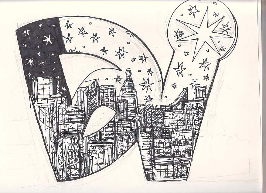
credit: SUBGARDEN
Ready to Share Your Work?
Do you typically work on one page at a time or across spreads?

—makes my chaotic lettering feel way more intentional.
I always run out of room and end up squishing in the last letters. Mrph