
Table of Contents
Every sketch begins with a surface. Before the first line lands, before graphite smudges or ink settles, the page itself sets the tone. Paper isn’t just a material — it’s the quiet partner in your sketchbook practice, shaping how you move, how you think, and how your ideas take form. Choosing the right paper is less about technical specs and more about finding the surface that feels like it understands you.
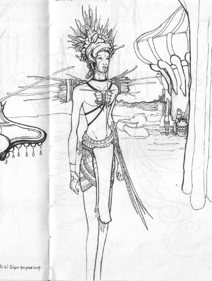
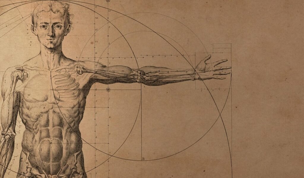
credit: jeidaniel
How to Choose the Right Sketchbook
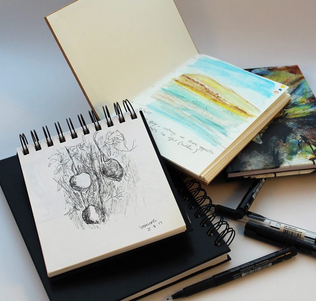
A sketchbook becomes a kind of portable studio — a place where your thoughts settle, your hand remembers its rhythms, and your ideas learn to breathe. The one you choose shapes how you move through your practice, how comfortable you feel inside the work, and how freely your marks unfold. A sketchbook isn’t just a container for drawings; it’s the environment where your creative life quietly takes root.
How a Sketchbook Shapes Your Creative Comfort
Every sketchbook has its own temperament. Some open flat and feel immediately accommodating, letting you stretch across a spread without fighting the binding. Others hold their pages more tightly, encouraging slower, more intimate work. The way a book handles — the way it sits in your hands, the way it bends or resists — affects how relaxed you feel while drawing.
A sketchbook that works against your natural pace can make even simple marks feel hesitant. But when the book supports your rhythm, the work flows. You flip pages without thinking. You settle into the surface. You forget the mechanics and fall into the drawing.
The Sketchbook You Carry vs. the Sketchbook You Work In
Most artists don’t live with just one sketchbook. We carry one size because it fits into a bag, because it’s light enough to take everywhere, because it’s the book that catches the small moments — the quick gestures, the passing ideas, the things you notice while waiting in line or sitting in the car.
But the sketchbook you carry isn’t always the sketchbook you work in.
The studio book is different. It’s larger, heavier, more grounded. It stays on the desk or the drafting table. It holds the drawings that require space — layered studies, slow observations, pages where you let your hand wander without worrying about portability. It’s the book you return to when you want to sink into the work rather than catch it on the fly.
And then there’s the class or workshop book — the one you bring to figure drawing sessions, plein‑air outings, or structured practice. It’s chosen for durability, for how it handles erasing, for how it responds to repetition. It becomes a record of learning, full of half‑finished gestures and notes to yourself.
Each book serves a different part of your creative life.
Each one holds a different version of your attention.
Binding as a Creative Choice
Binding isn’t just a structural detail — it changes the way you inhabit the page. A spiral‑bound book feels casual and accessible, perfect for quick studies and wide, open gestures. A stitched or perfect‑bound book feels more grounded, more like a place for sustained attention.
Some artists love the stability of a hardcover, especially when drawing outdoors or working without a table. Others prefer the looseness of a softcover, a book that bends with them and encourages unguarded exploration.
Scale and the Way You See
Size influences the kind of noticing you do. A pocket‑sized book invites small observations — the curve of a leaf, the tilt of a shoulder, the way light hits a window at dusk. A larger book opens the door to sweeping gestures and layered studies, the kind of drawings that require space to stretch out.
Neither is better. They simply tune your attention differently, shaping the way you move through the world with a pencil in hand.
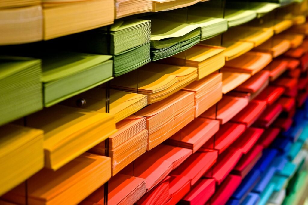
Paper Tone and Emotional Atmosphere
The color of the page shifts the entire mood of your sketchbook. White feels crisp and bright — a clean slate that sharpens contrast. Toned pages soften the experience, giving you a middle value to push against. Black pages turn highlights into the main event.
Paper tone isn’t just aesthetic; it influences how you perceive form, how you build value, and how your eyes rest on the page.
A Sketchbook That Matches Your Medium
Your tools have preferences, too. Ink wants smoothness. Charcoal wants tooth. Water wants strength. When your sketchbook aligns with the materials you reach for instinctively, the drawing feels natural — like the page is meeting you halfway instead of resisting your intentions.
Choosing a sketchbook becomes an act of listening: to your tools, to your habits, to the way your hand wants to move.
Finding the Book That Feels Like Home
The right sketchbook is the one that makes you want to draw. The one that feels comfortable in your hands. The one that supports your pace, your tools, and the way you see. When you open it, you should feel a small pull — an invitation.
When you find that book, it becomes more than a surface.
It becomes a companion — steady, responsive, and ready for whatever your hand needs to say next.
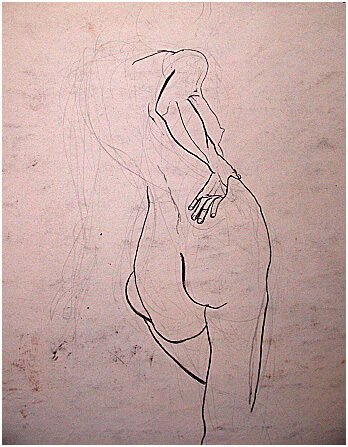
Understanding Different Types of Sketching Paper
Paper is the quiet force beneath every sketch — the surface that shapes your marks, your pace, and the emotional temperature of your drawing sessions. Once you start paying attention to it, you realize how much it influences your decisions. Some pages invite precision. Others encourage looseness. Some slow you down. Others let you move quickly. Understanding these surfaces isn’t about memorizing specs; it’s about learning how different papers respond to your hand and how they support the way you like to work.
Understanding Weight: How a Page Holds Your Gesture
Paper weight isn’t just a number — it’s the physical presence of the page. Lightweight sheets feel airy and responsive, perfect for quick graphite notes or charcoal gestures. Medium weights offer a steadier surface, something that can handle ink without buckling. Heavy papers feel almost architectural, ready for water, layering, and the kind of marks that require commitment.
You start to notice how weight affects your rhythm. Thin pages keep you moving. Thick pages ask you to slow down. And somewhere in the middle is the weight that feels like home — the one that supports your tools without interrupting your flow.
Texture and Tooth: The Surface That Meets Your Mark
Texture is where the conversation between tool and paper begins. Smooth pages let ink glide with a kind of quiet confidence. They hold detail beautifully, making every line feel intentional. Medium textures give graphite and colored pencil something to hold onto, creating soft transitions and gentle shadows. Rougher surfaces invite bolder gestures — charcoal clings, pastel blooms, and the drawing becomes more physical.
Texture isn’t about right or wrong. It’s about how you like your marks to feel. Some artists crave the glide. Others crave the grip. Most of us move between the two depending on the day.
How Processing Shapes the Page
The way a sheet is pressed changes everything. Hot‑pressed paper feels almost polished — a smooth, low‑tooth surface that rewards precision and crisp edges. Cold‑pressed paper carries a subtle grain, a balance between smoothness and texture that works beautifully for graphite, watercolor, and mixed media. Rough paper feels alive under your hand, full of peaks and valleys that catch pigment in unexpected ways.
These differences aren’t technical trivia — they’re emotional. Hot press sharpens your attention. Cold press softens it. Rough paper encourages you to let go.
Drawing Paper: The Familiar Everyday Surface
Drawing paper is the workhorse of many sketchbooks — sturdy enough for layering, gentle enough for erasing, and responsive to graphite, charcoal, and colored pencil. It’s the kind of surface that doesn’t demand anything specific from you. It simply receives whatever you bring. For many artists, this becomes the daily page, the place where ideas first take shape.
Cartridge Paper: The All-Purpose Standard for Sketching
Cartridge paper is the backbone of the sketching world. Originally named for its use in making paper cartridges for firearms, it has evolved into the most common, high-quality surface for dry media. It is slightly heavier and toothier than standard printer paper, making it the “Goldilocks” surface—not too smooth, not too rough.
Weight and Durability | Why Cartridge Paper Handles Layering Most cartridge paper sits between 100gsm and 150gsm. This weight is the sweet spot for a portable sketchbook; it’s heavy enough to handle repeated erasing and multiple layers of graphite without tearing, but light enough to keep a 100-page book from becoming too bulky to carry.
Surface Versatility | A Reliable Partner for Graphite and Ink What makes cartridge paper a staple is its “tooth” (the microscopic texture of the surface). It has just enough grip to grab onto graphite and colored pencil, allowing for deep blacks and smooth gradients. While it isn’t designed for heavy watercolor, it can handle light ink work and fineliners without the “feathering” you see on cheaper papers.
Sketchbook Paper: The Page That Learns Your Habits
Sketchbook paper varies wildly, but the best of it feels like a companion. It absorbs your routines — the warm‑ups, the late‑night studies, the half‑formed ideas. Some sketchbooks lean toward smoothness, others toward tooth, but the magic lies in how the paper supports your natural pace. A good sketchbook page feels like it’s listening.
Watercolor Paper: When Water Joins the Conversation
Water changes the entire dynamic of a page. It needs strength — a surface that can swell, settle, and dry without collapsing. Watercolor paper, whether hot press, cold press, or rough, becomes a partner in that slow, fluid process. Washes bloom. Edges soften. Pigment settles into the grain. The page guides you as much as you guide it, creating a rhythm that feels almost meditative.
Bristol Board: The Surface for Clarity and Clean Lines
Bristol has a kind of quiet authority. Smooth Bristol holds ink with remarkable crispness, making it a favorite for artists who love precision — comic artists, illustrators, anyone who wants their lines to feel clean and intentional. Vellum Bristol adds a whisper of texture, giving graphite and charcoal just enough grip to build tone without losing detail. It’s a surface that rewards patience.
Mixed Media Paper: The Page That Says Yes
Mixed media paper is for artists who refuse to choose. It welcomes pencil, ink, watercolor, collage, and whatever else you feel like testing that day. It’s sturdy without being stiff, textured without being demanding. For many sketchbook artists, this becomes the perfect middle ground — a page that adapts to your curiosity.
Newsprint: The Page That Frees You
Newsprint is the opposite of precious. It’s thin, inexpensive, and wonderfully temporary. It invites quick gestures, warm‑ups, and the kind of drawing that loosens your hand. Because it isn’t meant to last, it removes pressure. You draw more freely. You experiment. You let the page catch whatever needs to come out first.
The Guide to Toned & Colored Papers
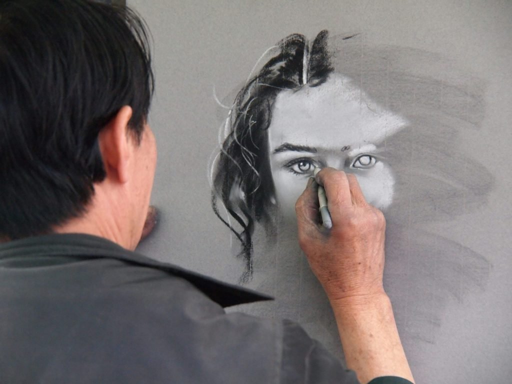
Toned paper shifts the entire experience of drawing. Instead of beginning in the bright emptiness of a white page, you start in the middle — a soft gray, a warm tan, a deep charcoal. The tone sets the atmosphere before your pencil even touches the surface. It gives you a place to push shadows deeper and lift highlights forward, letting the drawing emerge from balance rather than blankness.
A Middle Value That Changes Your Approach
Working on toned paper feels like stepping into a room where the light is already arranged. The page holds a quiet mid‑tone that becomes your third tool — not something you add, but something you collaborate with. Shadows fall into the paper naturally. Highlights rise with a single stroke. Even the simplest sketch feels grounded, as if the page is already halfway toward becoming an image.
Figures feel sculptural. Portraits feel immediate. Still lifes take on a hushed depth. Toned pages carry mood effortlessly, giving even quick studies a sense of presence.
A Surface That Encourages Sculptural Thinking
Toned paper invites you to think in planes rather than outlines. You’re not just drawing lines — you’re shaping form, carving light, letting the page hold the middle values while you push the extremes. Dark media like charcoal or soft graphite settle into the shadows with ease. White chalk or pastel lifts the light, creating a luminous edge that feels almost carved.
This approach teaches you to see differently. You begin to notice where the light actually falls, where it softens, where it breaks. The page becomes a quiet mentor in understanding value.
A Gateway to New Materials and New Ways of Seeing
One of the quiet joys of toned paper is how it opens you to materials you might never have considered. Darker tones — charcoal gray, deep navy, rich black — become stages for tools that simply don’t sing on white paper.
Metallic markers, for example, feel almost ceremonial on dark surfaces. Gold, silver, and copper don’t just sit on the page — they glow. They catch light as you tilt the sketchbook, shifting from soft shimmer to bright gleam. The effect is intimate and dramatic, like drawing with small pieces of light.
Working with metallics on dark paper slows you down. Every mark becomes visible. Every gesture feels intentional. The page becomes a quiet night sky, and your lines become constellations.
The Emotional Tone of Metallics on Dark Pages
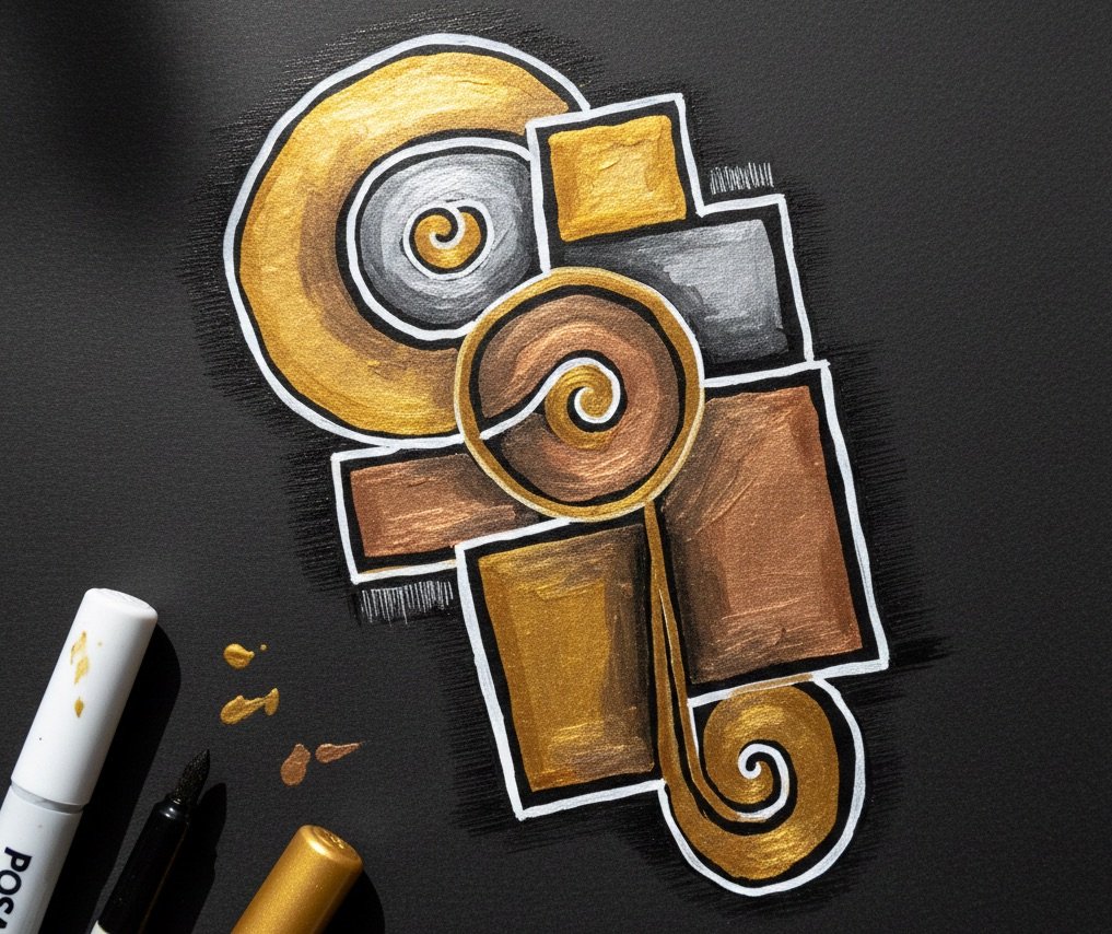
Metallics bring their own personalities. Gold feels warm and celebratory, like sunlight captured in ink. Silver feels lunar — cool, reflective, slightly mysterious. Copper feels earthy and grounded, glowing with a quiet richness.
On dark paper, these tones become elemental. They create a visual rhythm that feels both ancient and modern, especially when paired with white and black markers for contrast. White adds clarity and breath. Black deepens shadows and sharpens edges. Together, they create a small, expressive toolkit that feels endlessly adaptable.
Why Toned Paper Expands Your Creative Vocabulary
Toned paper doesn’t just change the look of your drawings — it changes the way you think about materials. It invites experimentation. It encourages restraint. It rewards simplicity. It teaches you to let the page do part of the work.
And it opens the door to mediums that feel magical on darker surfaces: metallic inks, gel pens, opaque markers, chalk, pastel, even subtle gouache. Suddenly your sketchbook becomes a place where light behaves differently, where contrast becomes a design element, where the page itself participates in the drawing.
A Surface That Invites Presence
More than anything, toned paper creates presence. Even a loose sketch feels intentional. Even a quick study feels grounded. The tone gives the drawing a quiet gravity — a sense that it belongs to a moment, not just a page.
When you work on toned paper, you’re not fighting the blankness. You’re collaborating with the surface. You’re letting the page guide you, support you, and sometimes surprise you.
Handmade & Specialty Papers: Texture as a Voice
Handmade and specialty papers carry a presence you can feel before you even make a mark. They’re irregular, textured, sometimes unpredictable — and that’s exactly what makes them compelling. These pages don’t just hold your drawings; they shape them. They influence your gestures, your pacing, and the way you respond to the surface. Working on handmade paper feels less like using a tool and more like entering a conversation.
The Surface That Invites Precision
Some specialty papers are pressed so smoothly that ink seems to glide across them with a quiet certainty. Fine graphite settles into the fibers without resistance. Edges stay clean. Lines feel architectural, almost meditative. These surfaces steady your hand and sharpen your attention, creating a space where detail feels natural and clarity feels effortless.
Texture That Encourages Expression
Other papers carry a tooth that changes everything. Charcoal grips. Soft pencils create velvety shadows. Pastel settles into the grain with a physicality you can feel through your fingertips. These pages invite movement — the kind of drawing where you chase energy rather than accuracy. They’re perfect for gesture, atmosphere, and sketches that feel more like breathing than planning.
When Water Joins the Conversation
Some handmade papers are strong enough to welcome water — a wash of ink, a diluted pigment, a brush that moves more like breath than line. Heavy, textured sheets absorb moisture slowly, encouraging patience. Edges soften. Colors settle. The page becomes a collaborator, guiding the flow of pigment and slowing your pace in a way that feels intentional. Wet media turns into a dialogue between water, fiber, and intuition.
Why Artists Are Drawn to Handmade Paper
Handmade paper carries a kind of soul. You can see the fibers, the deckled edges, the slight variations from sheet to sheet. Nothing is perfectly uniform — and that irregularity becomes part of the work. These papers feel alive. They ask you to respond, to adapt, to let go of control in small, meaningful ways.
They’re especially beloved for their tactile presence, their natural textures, and the way they hold expressive marks. Handmade paper doesn’t just support your drawing — it influences your decisions, your marks, and the emotional tone of the page.
When Bookbinding Becomes Part of the Art
A handmade‑paper sketchbook becomes even more meaningful when you consider the stitching that holds it together. Binding isn’t just a method of assembly — it’s a craft with its own quiet poetry.
Coptic stitching, kettle stitching, long‑stitch bindings — each creates a different relationship between page and spine. Some open completely flat, inviting wide spreads and uninterrupted gestures. Others create a gentle tension, encouraging slower, more intimate work. The thread becomes part of the book’s personality, visible along the spine like a line of hand‑drawn marks.
There’s something grounding about holding a book where you can see the stitches, feel the knots, sense the human hands that assembled it. The binding becomes a reminder that the sketchbook itself is handmade — not just the drawings inside it.
Making Your Own Paper: When the Surface Becomes Personal
There’s something deeply grounding about creating your own sketchbook paper. It turns the page into part of your practice, not just a surface you work on. When you make paper by hand, you choose the texture, the thickness, the color, the fibers. You decide how smooth or rugged the sheet should feel. You build the surface that will later hold your ideas.
The process is slow, tactile, and surprisingly meditative — tearing old paper, soaking it, blending it into pulp, lifting a new sheet from the water. Each page carries the memory of your hands. Each sheet becomes a small artifact of your creative life.
And when you bind those pages yourself — stitching them into a book that opens the way you want it to, that bends or resists in ways that feel familiar — the sketchbook becomes more than a tool. It becomes a companion you built from the ground up.
When Texture Becomes a Creative Partner
Handmade and specialty papers remind you that drawing isn’t just about the marks you make — it’s about the surface that receives them. These papers slow you down, shift your attention, and invite you to notice the small things: the drag of charcoal, the bloom of water, the way a pencil catches on a raised fiber.
They become more than pages.
They become voices — subtle, textured, and full of character — guiding your hand toward new ways of seeing.
Paper Longevity: Archival Qualities to Look For
Paper doesn’t just hold your drawings — it carries them forward. The way a sheet ages, the way it responds to light and time and handling, becomes part of your sketchbook’s story. Some pages stay bright and steady for decades. Others soften, yellow, or grow more delicate with age. Understanding how paper lives over time helps you choose surfaces that honor the work you place on them.
How Paper Ages in a Sketchbook
Every paper has its own temperament. Some remain crisp and neutral for years, barely shifting in tone. Others warm with age, taking on a gentle patina that feels almost nostalgic. And some papers — especially those made from wood pulp with acidic fibers — break down more quickly, becoming brittle or yellow as the years pass.
None of this is inherently good or bad. It’s simply part of the material’s nature. But knowing how a page will age lets you choose the right surface for the drawings you want to keep close.
Why Acid‑Free and Archival Fibers Matter
Acid‑free paper isn’t just a marketing term — it’s a promise of stability. When the fibers are neutralized, the paper resists the slow burn of oxidation that causes yellowing and brittleness. Archival papers, often made from cotton or other long fibers, stay strong and flexible even after years of turning pages.
For artists who keep long‑term sketchbooks or create work they hope will last, these qualities matter. They protect the subtle graphite transitions, the soft charcoal shadows, the delicate ink lines that might otherwise fade or shift.
The Role of Light, Touch, and Time
Sketchbooks are handled more than any other art object. They’re opened, closed, flipped through, carried, packed, unpacked. The oils from your hands, the light that hits the page, the simple act of turning a sheet — all of it shapes how the paper ages.
Some artists love this. They want their sketchbooks to feel lived‑in, softened by use. Others prefer pages that stay as close as possible to their original state. Both approaches are valid. What matters is choosing paper that aligns with your relationship to time.
When Impermanence Becomes Part of the Beauty
Not every drawing needs to last forever. Some pages are meant to be temporary — warm‑ups, experiments, quick studies that teach your hand something in the moment. Newsprint, kraft paper, and other non‑archival surfaces age quickly, but they also invite freedom. They remind you that not all work needs to be preserved; some simply needs to be made.
There’s a quiet beauty in that impermanence. It keeps the practice alive, fluid, and unburdened.
Choosing Longevity That Matches Your Intent
Archival quality isn’t about perfection — it’s about intention. If a sketchbook is a place for exploration, you may not need museum‑grade paper. But if it’s a record of your growth, a companion you’ll return to for years, or a book you hope will outlive you, choosing stable, acid‑free, well‑made paper becomes an act of care.
Longevity is simply another layer of the creative process — a way of honoring the work you place on the page and the time you spend with it.
 Sketchbooks.org | TECHNIQUES & PROCESS
Timed Minimalism | The Impact of Bold, Expressive Lines
Explore the impact of simplicity. Discover how bold, expressive lines can capture the essence of a subject in a limited amount of time.
Frequently Asked Questions
What paper weight feels good for sketching?
Mid‑range weights hold up to erasing and layering without feeling stiff.
Does smooth paper work well with ink?
Yes — smooth surfaces keep ink lines crisp and intentional.
Can I sketch with watercolor in my book?
Light washes work beautifully on heavier pages designed for moisture.
Is toned paper beginner‑friendly?
Absolutely — it helps you see value relationships from the first mark.
What paper supports soft charcoal?
A lightly textured surface gives charcoal room to settle and blend.
Why do some pages buckle with wet media?
Thin or absorbent papers can’t support moisture evenly.
Is thicker paper always better?
Not always — the best weight depends on your tools and your pace.
Do artists use different papers for different moods?
Many do. Paper becomes part of the emotional language of a sketchbook.
Why do some papers yellow over time?
Non‑archival fibers break down, especially in lightweight practice sheets.
Final Thoughts
Paper is more than a surface — it’s the quiet partner in every sketchbook, the material that listens, absorbs, and responds to the way you move. Once you start paying attention to it, you realize how much it shapes your practice. A forgiving page keeps you loose. A smooth one sharpens your focus. A toned sheet shifts the way you see light. Handmade paper slows you down and reminds you that materials have their own stories.
Choosing the right paper isn’t about perfection. It’s about finding the surfaces that feel like they understand you — the ones that support your pace, your tools, and the way your ideas arrive. When the paper aligns with your creative rhythm, the sketchbook becomes more than a book. It becomes a place where your attention deepens, where your gestures feel honest, where your creative voice grows without hesitation.
The right page doesn’t just hold your drawings. It holds the way you see the world.
credit: jclamond
Ready to Share Your Work?
What is your favorite sketchbook medium?

Paper actually can make me draw bad! Poor paper is like playing a toy keyboard instead of a piano. No ‘FEEL’
Like spreading butter on toast!